Case Study · Product Design · Desktop App
EDUC - OpenUP Project Overview
I restructured navigation, rebuilt search and filters, and introduced role‑coded cues (brand color paired with explicit labels) to make OpenUp faster to scan and use; improving task speed, success, and SUS while staying WCAG‑compliant.
Disclaimer
I handled the product design work end-to-end. For the initial research phase and data collection, I collaborated with a group of researchers, students, and employees.
Impact in Numbers
Avg time-to-task
122s → 74s
Task success
60% → 84%
SUS
63.3 → 75.0
FCC
60 → 86.7
The Context
OpenUp is an alliance academic platform (think LinkedIn for academia) spanning Jobs, Calls, Projects, Events, Groups and more.
The Challenge
Engagement and usability had dipped: the left‑rail nav didn't scale, filters were hard to access and use, labels were generic, and contrast/hierarchy were weak.
What We Learned
ResearchGate dominated platform usage (29% of respondents), revealing that researchers are already comfortable with academic social networks and expect similar patterns in OpenUp.
What We Changed
4 key design moves to improve the experience.
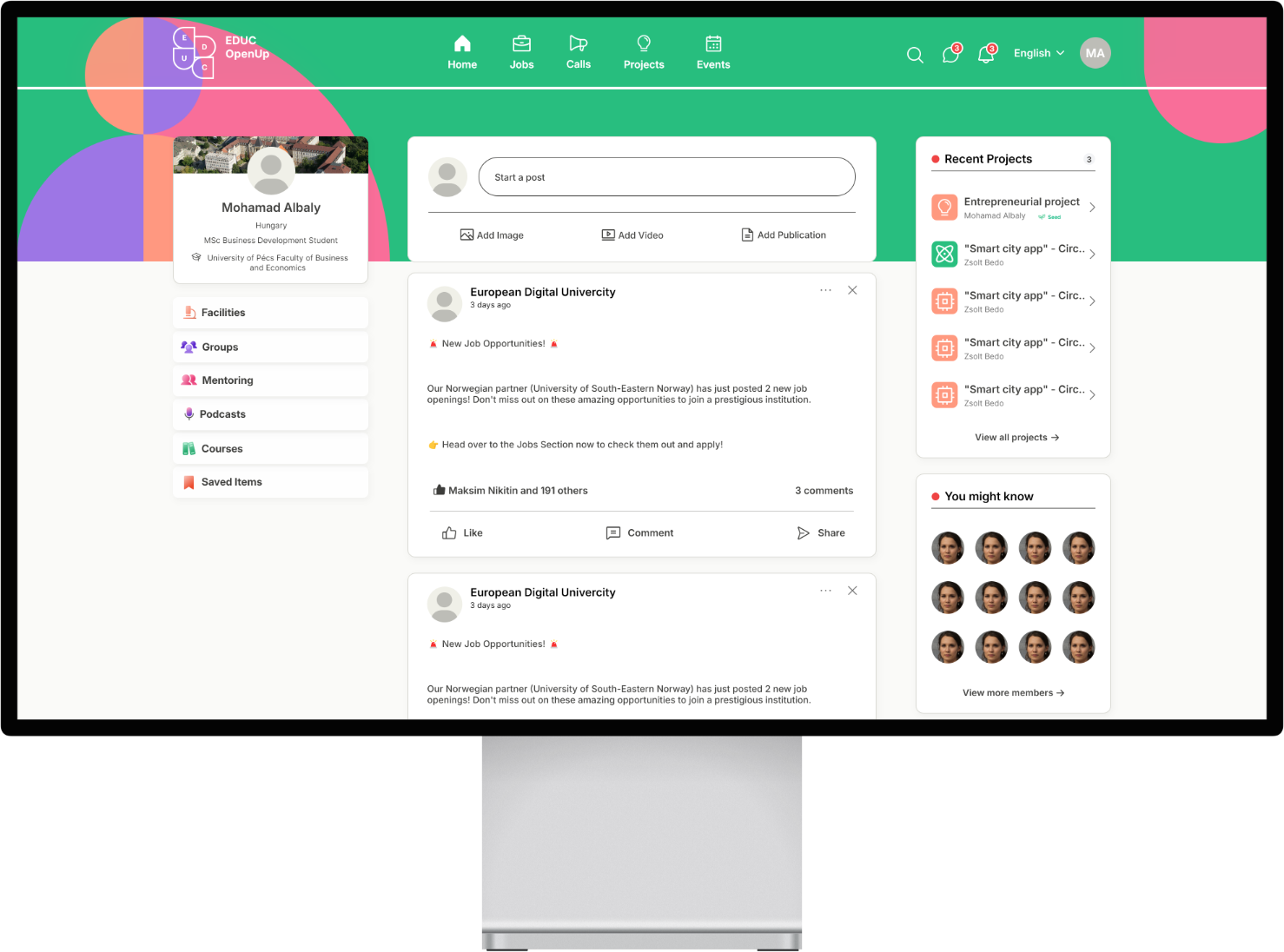
1) Clarified IA and primary navigation
Move Home, Jobs, Calls, Projects, Events into a top navbar; keep secondary areas (Facilities, Groups, Mentoring, Podcasts, Courses) in the side rail; add Saved for retrieval.
Scroll to see more →
2) Made filters findable and faster to use
Sticky filters, prioritized facets, progressive disclosure for secondary options; refined labels via card sorting.
Scroll to see more →
3) Added role‑coded cues (color + label)
Map EDUC brand colors to five personas and use only on repeatable surfaces: cards in mixed lists with outline stroke + labeled role badge.
Scroll to see more →
4) Tokenized hierarchy and accessibility
Apply design‑system tokens (type scale, spacing), soften elevation, standardize CTA color, meet AA contrast and hit‑target sizes.
Scroll to see more →
How We Validated
Ensuring our solutions met user needs through rigorous testing.
Worked with project coordinators and a cross‑functional research group (students, staff, researcher) for walkthroughs and tests. Produced token‑level specs (where role colors do and do not appear), component states, and IA/filter documentation to support handoff.
The Results
Measuring the impact across key performance indicators.
Time-to-Task
Users completed tasks significantly faster with the new navigation and filter system.
Task Success
More users successfully completed their intended tasks without errors or confusion.
SUS Score
Overall system usability improved, crossing into the 'good' usability threshold.
First-Click Correctness
Role-coded cues helped users identify the right content type on their first attempt.
Want to dive deeper?
Explore more insights and details from this case study